GE Digital
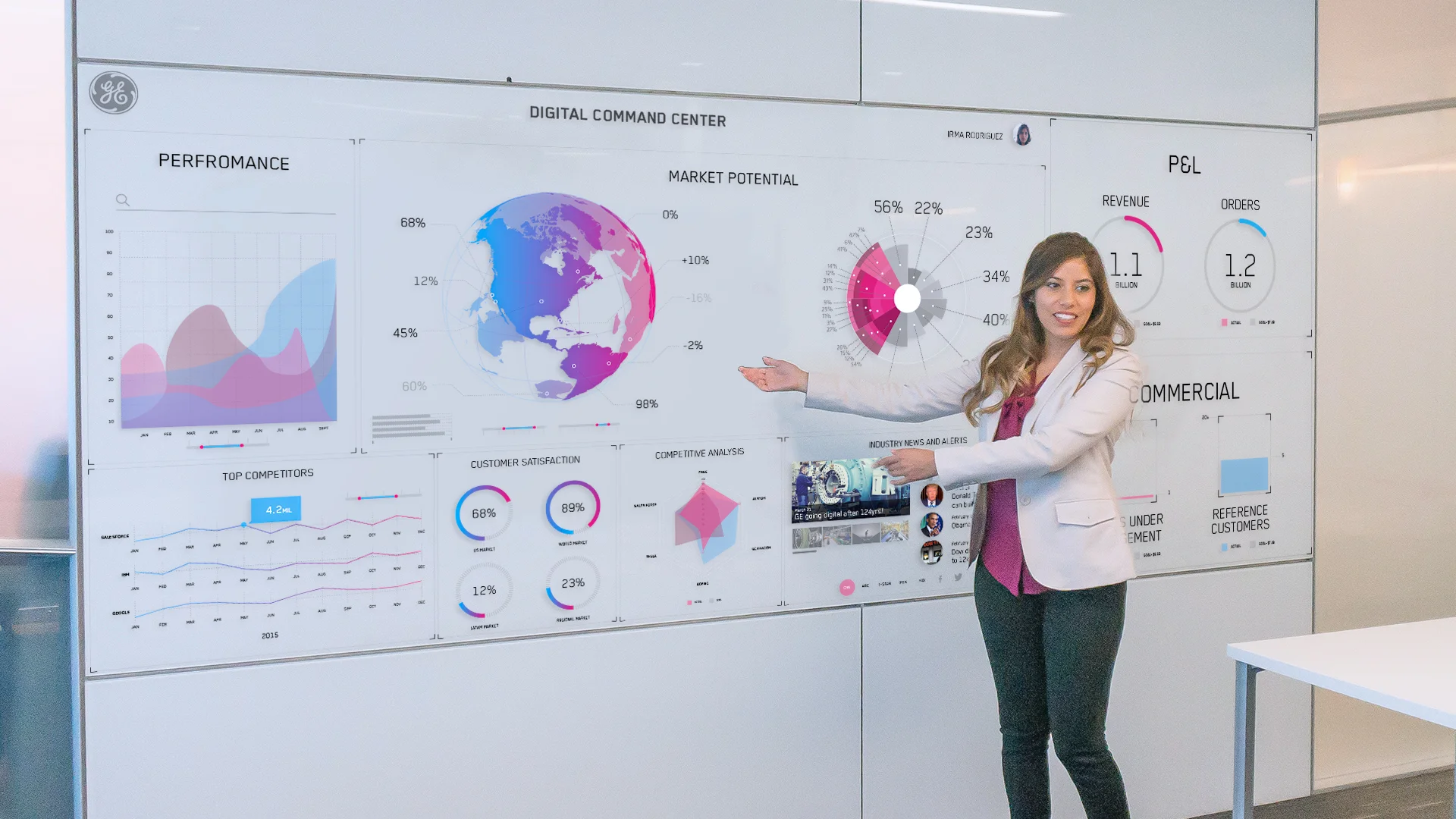
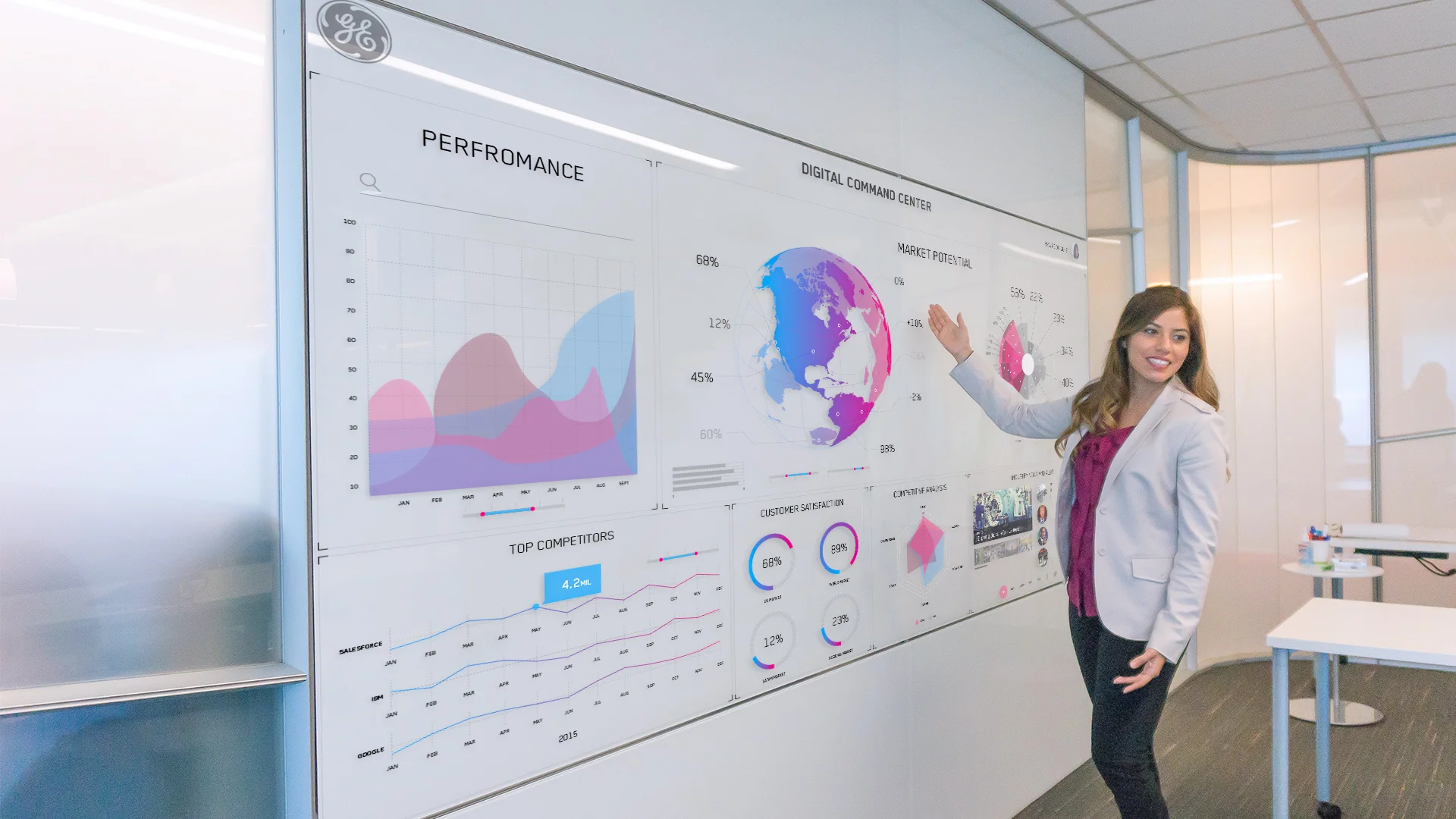
Digital Command Center
Project Overview
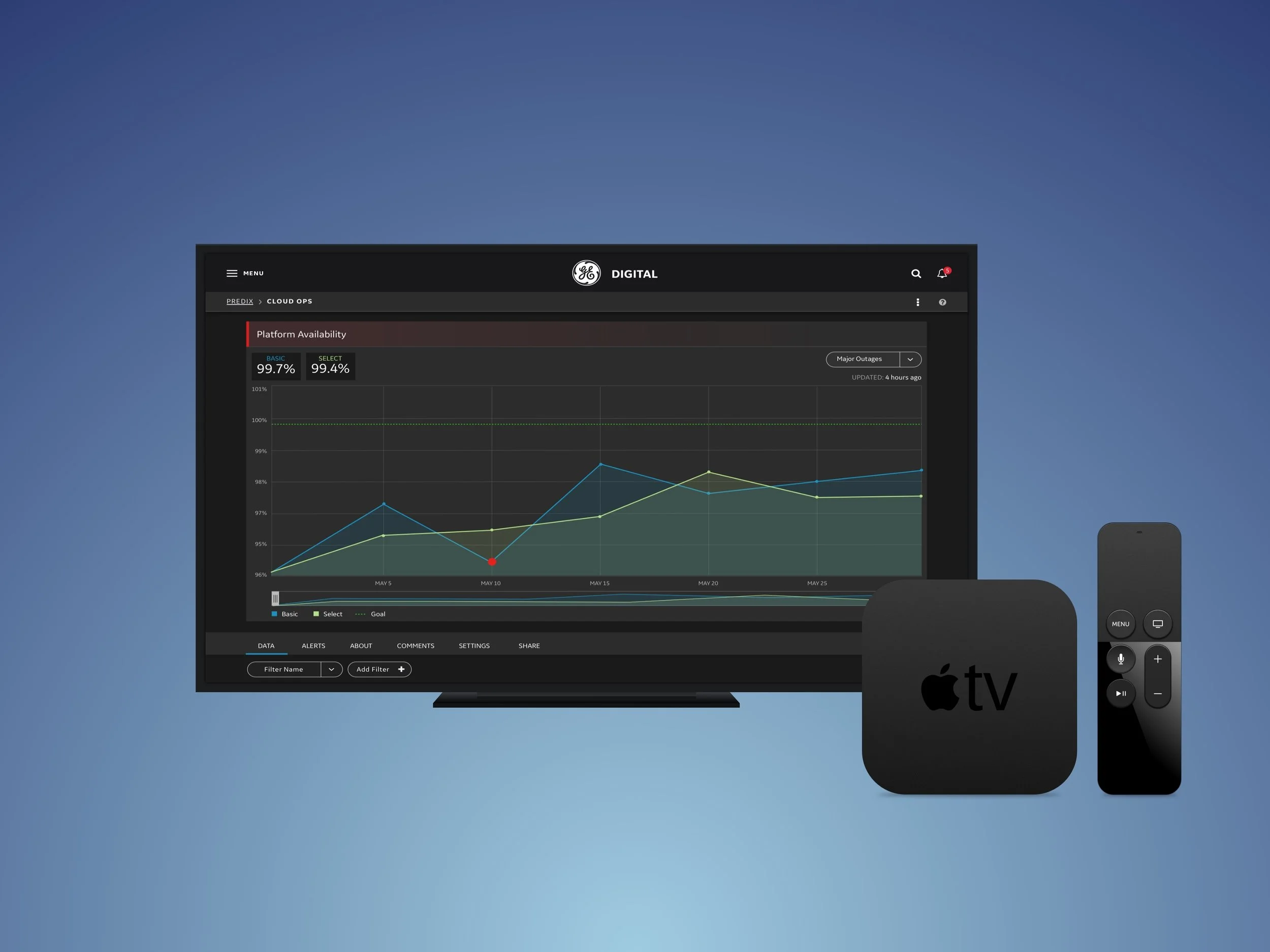
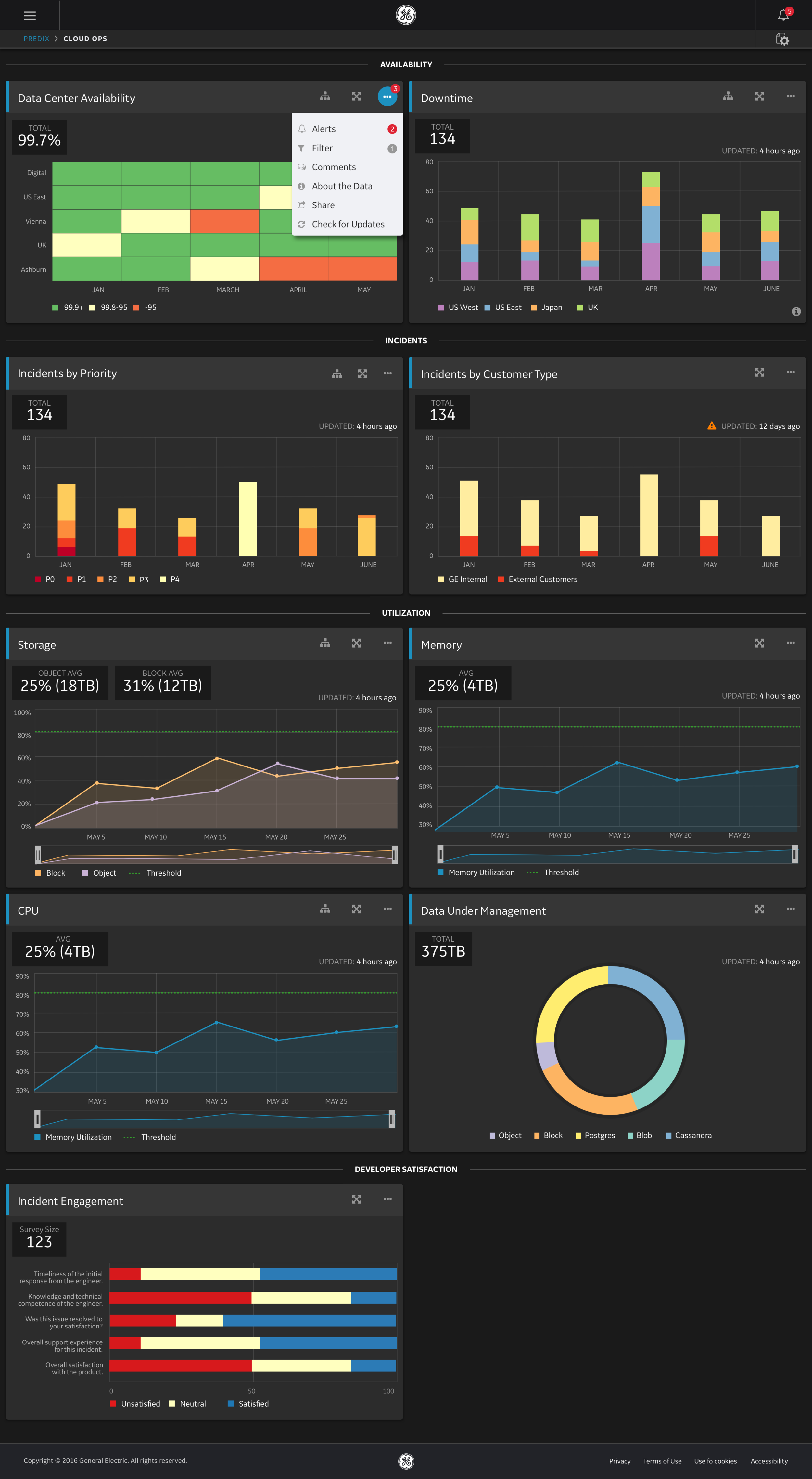
The Digital Command Center (DCC) is a powerful data visualization tool, powered by Predix.
DCC offers operational insights into key factors that drive GE Digital’s success. Delivering timely, accurate and actionable business insights is important for building a culture of transparency and accountability.
My Role
I lead the UX visual design for the DCC, a product offering operational insights into key factors that drive GE Digital’s success.
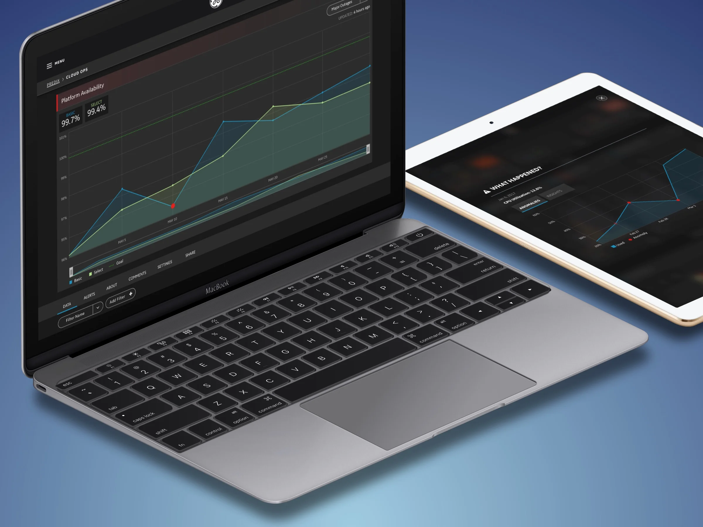
I collaborated closely with Interaction Designers, and led UX design for product onboarding, data visualization, and responsive design ensuring the app worked on small screens as well as large format displays.
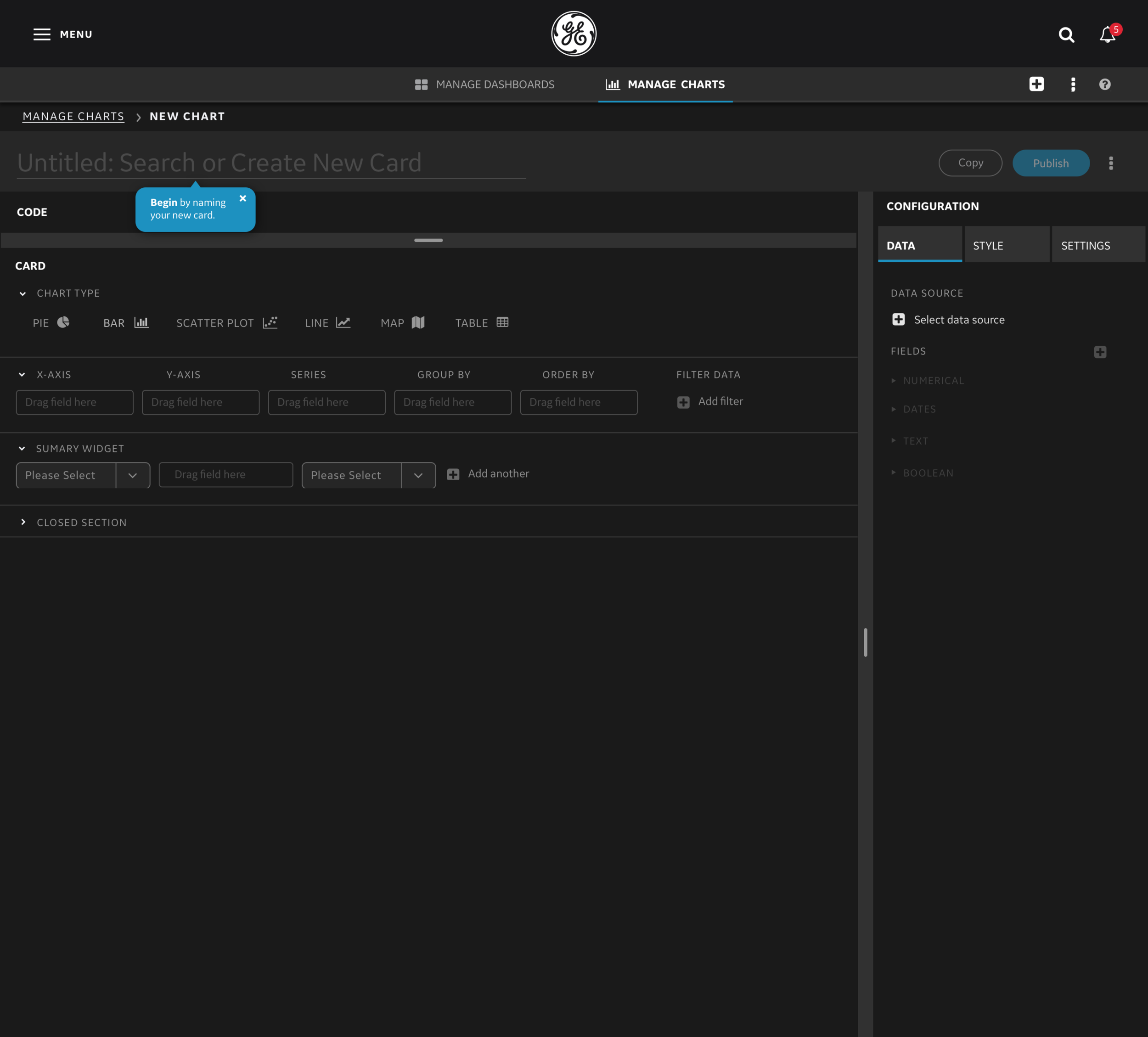
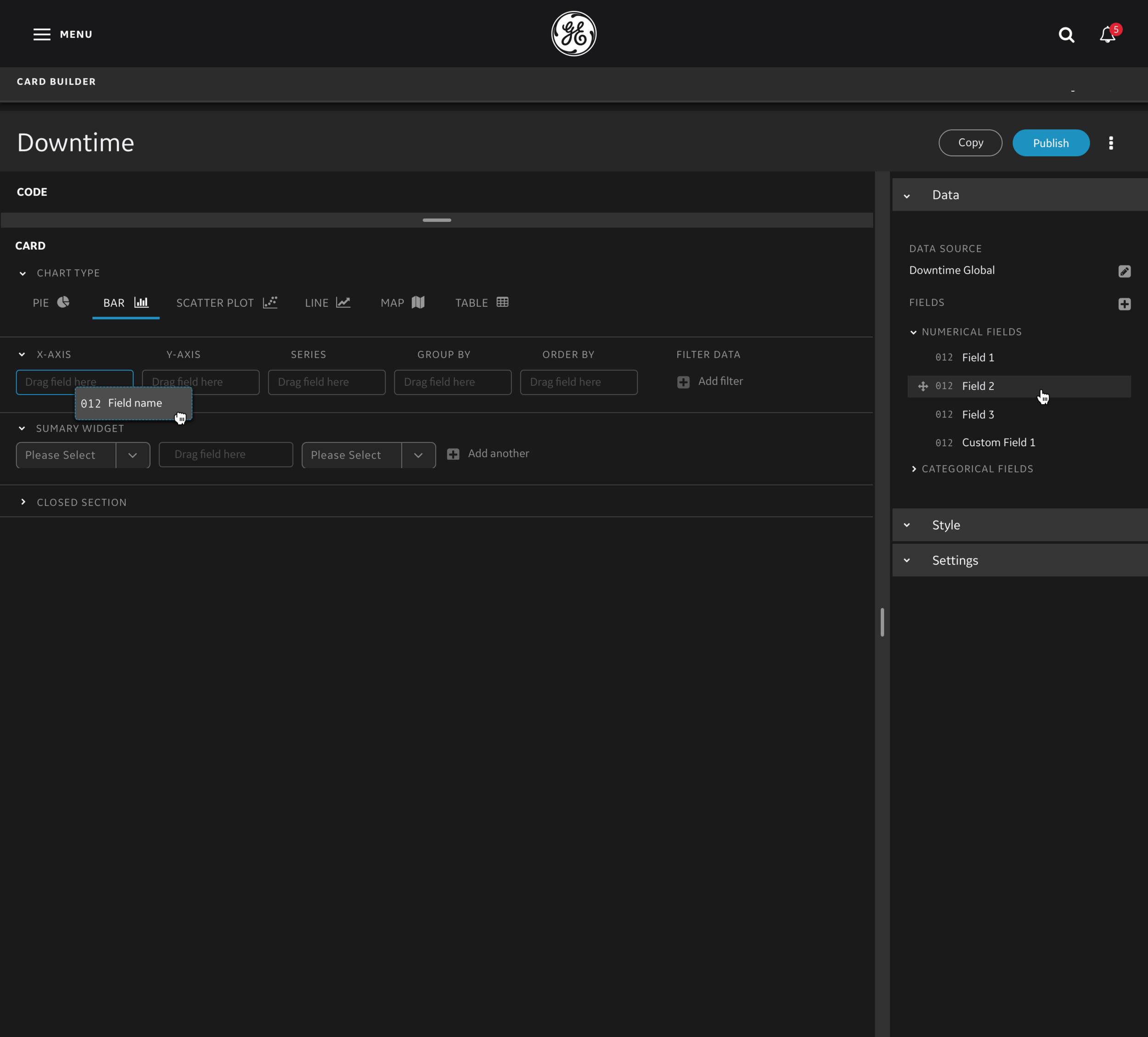
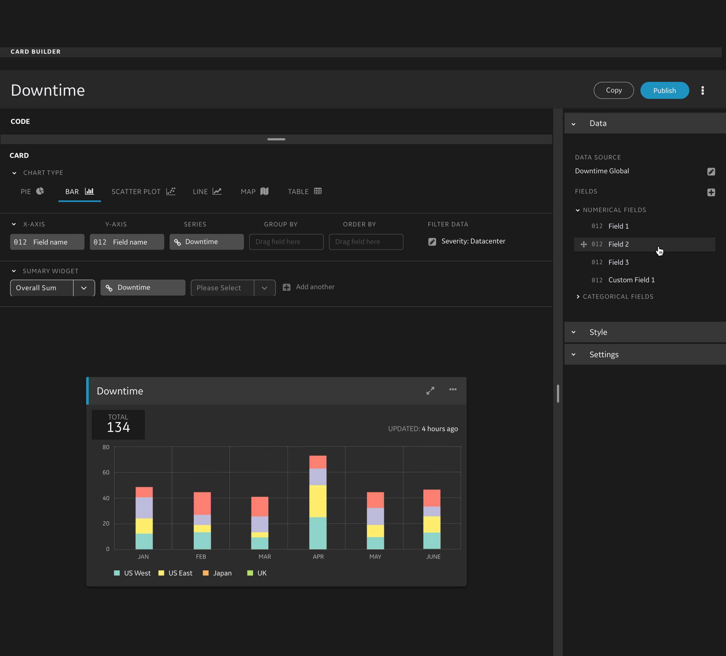
In a paired design collaboration, I worked closely with another UX designer to create a robust self-service chart and dashboard building feature. It allowed users to ingest data, choose visualizations, and create custom dashboards for their unique needs.
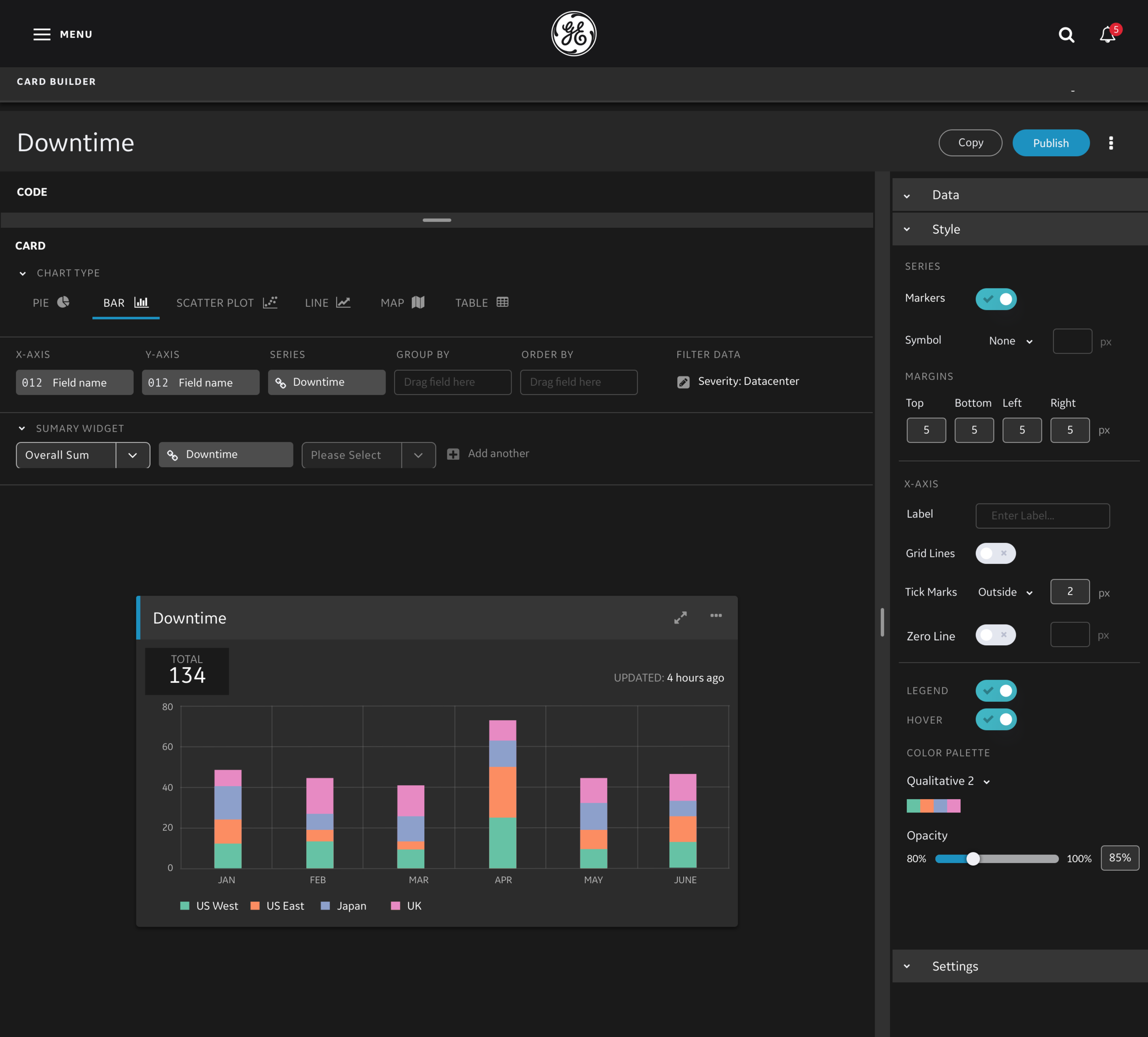
I worked closely with data scientists and engineers on this project to create elegant solutions to meet specific business requirements. I led the design of all of the data visualizations in the application, creating a design system to ensure consistency in the visualizations, and also allow for customization by the users.
To accomplish this, we did a lot of rapid design, prototyping, and user testing to make sure we were creating a simple, intuitive product that was also powerful enough to solve the business needs.
Working in an agile environment, I created and reviewed user stories to ensure we had the proper requirements and acceptance criteria to succeed.
In addition to product design, I championed an initiative to educate and evangelize data visualization best practices throughout GE. I am very passionate about data visualization and learned a ton through my research and experience. As part of this initiative I synthesized my research and finding into a detailed “Data Visualization Best Practices” document I shared throughout the organization. I also conducted “Data Visualization Design Bootcamp” sessions to help educate other teams on best practices for designing visualizations and working with complex data.
This was a wonderful project to work on! I learned to adapt quickly, and deliver quality in a high pressure, fast pace environment. I got to work directly with some of the most senior executives in the company solving problems and responding quickly to many new requests on the fly.
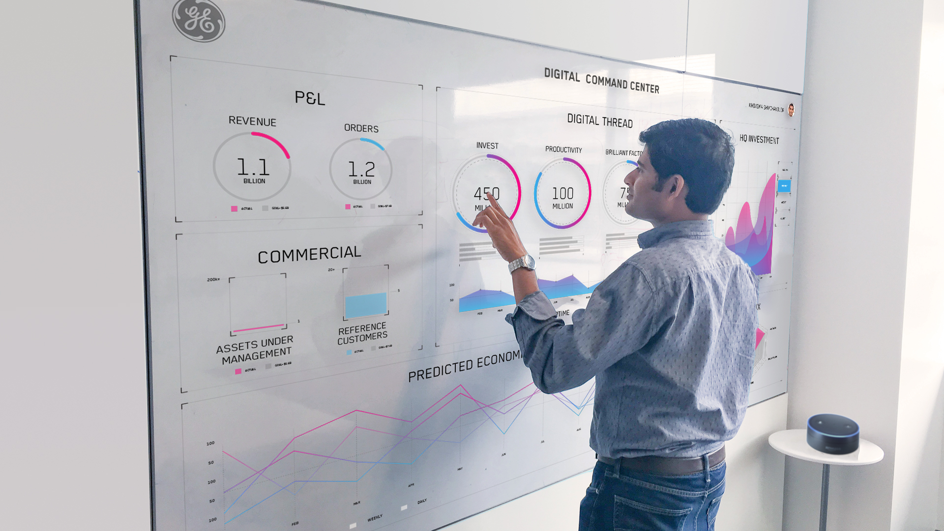
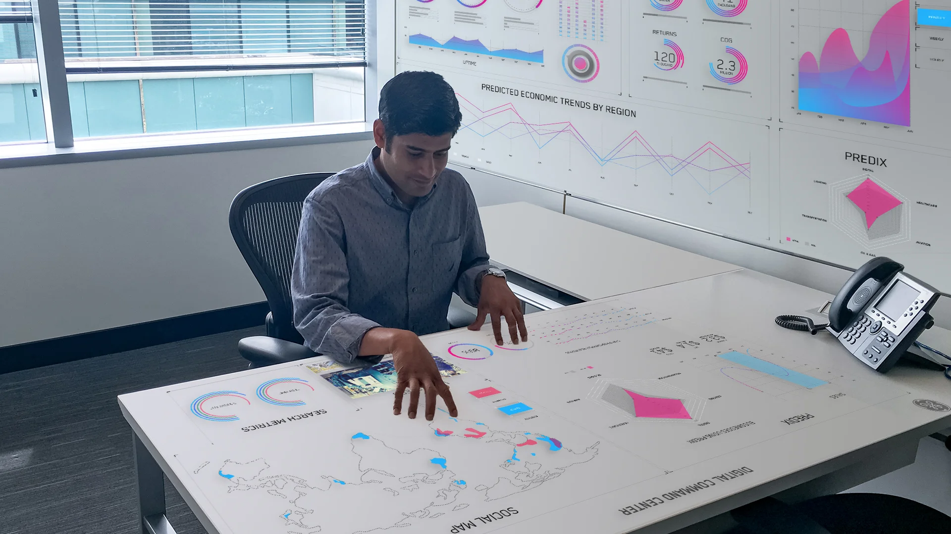
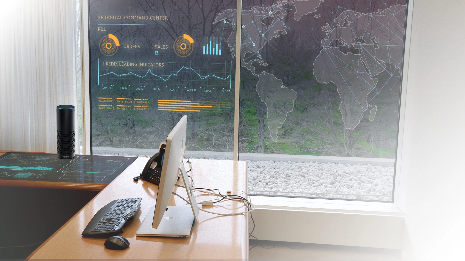
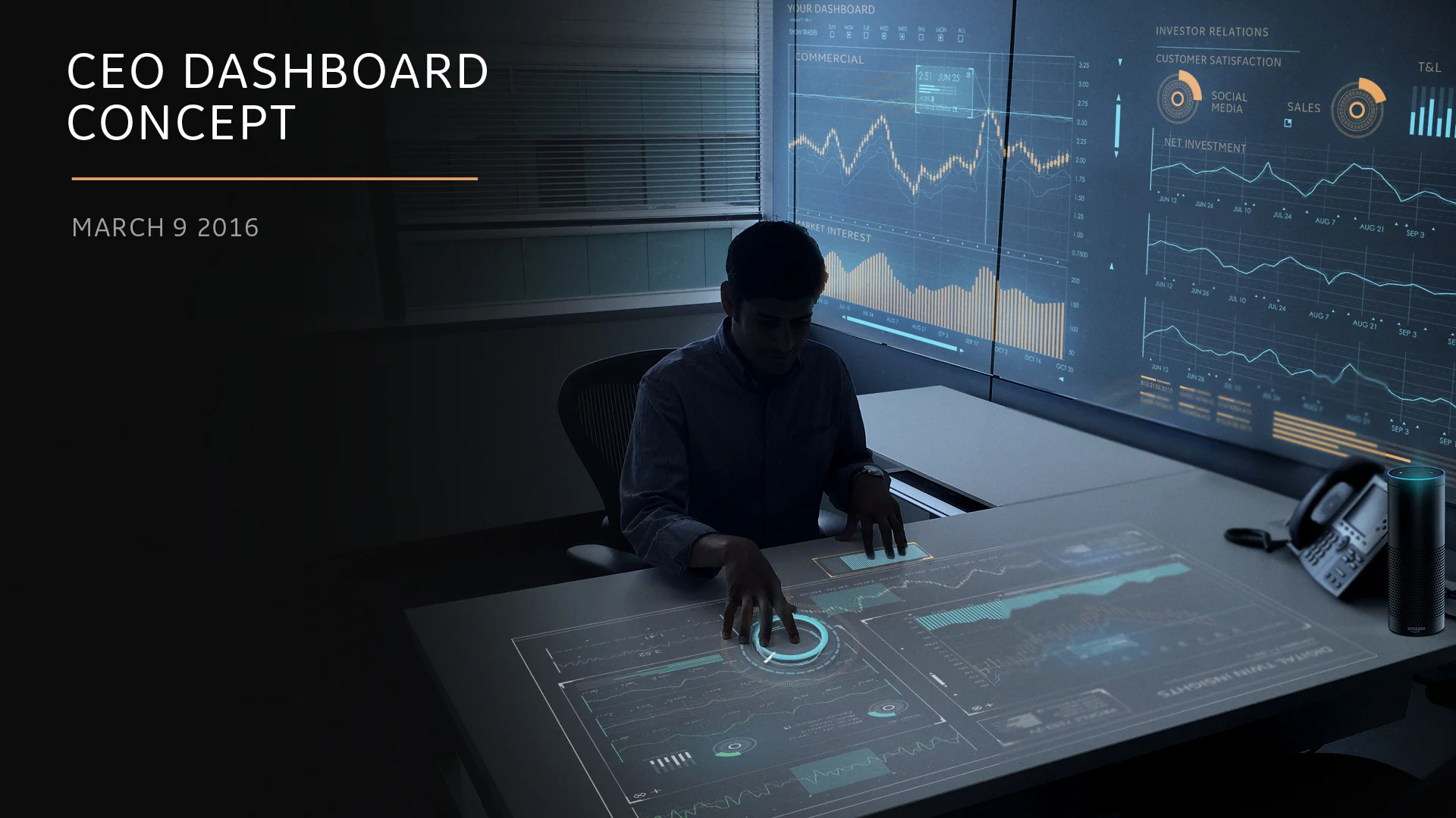
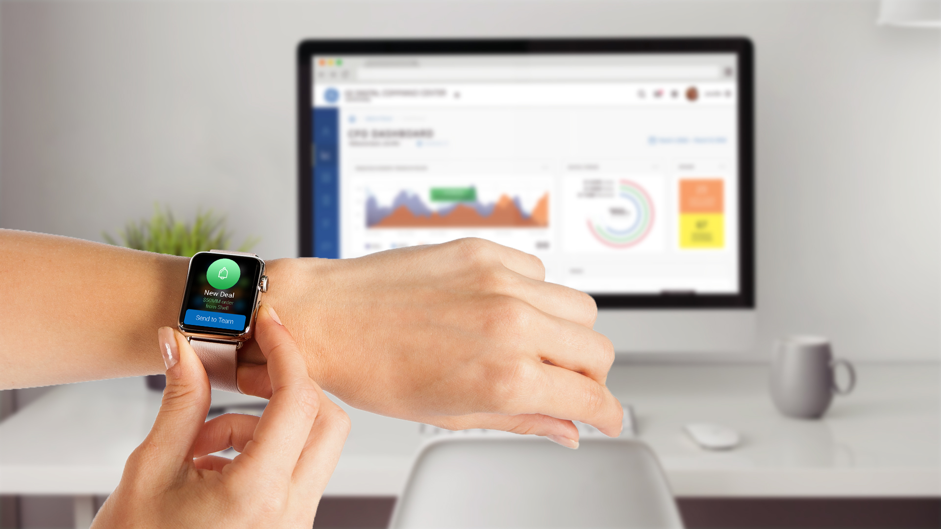
Exploration / ideation
During the discovery phase of the DCC we explored a lot of different, future thinking ideas. Below is a gallery of explorations using innovative technology like projectors and touch screens.
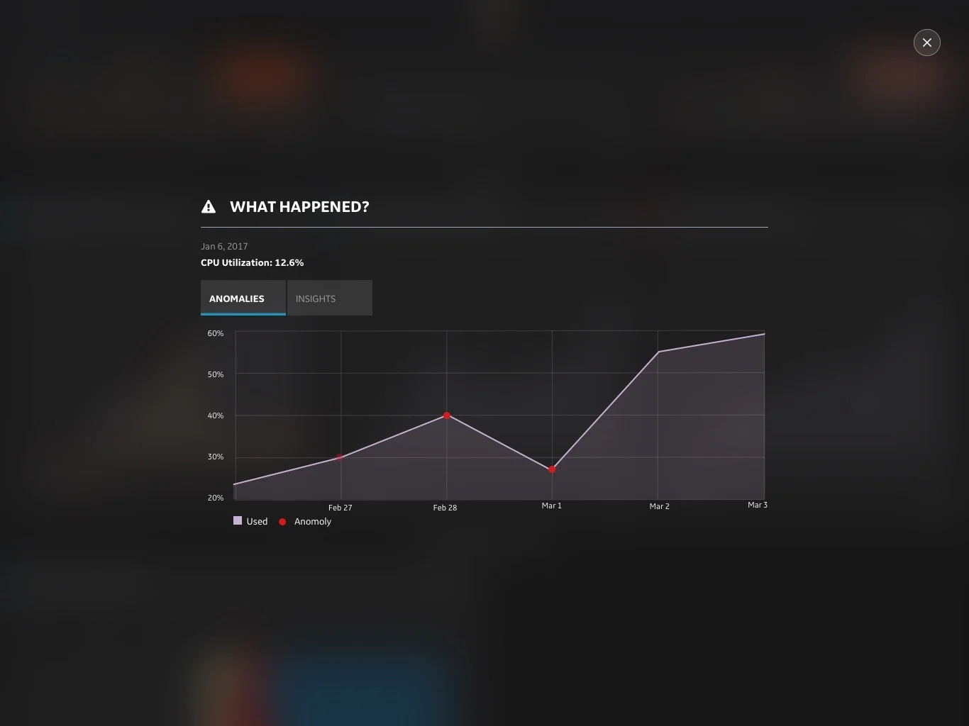
Anomaly Detection with Machine Learning
Partnering with out tech team, we developed an anomaly detection system that uses machine learning to identify when something is not right.
In a future release, users will be able to create the thresholds to detect whatever anomaly they want to be notified about.
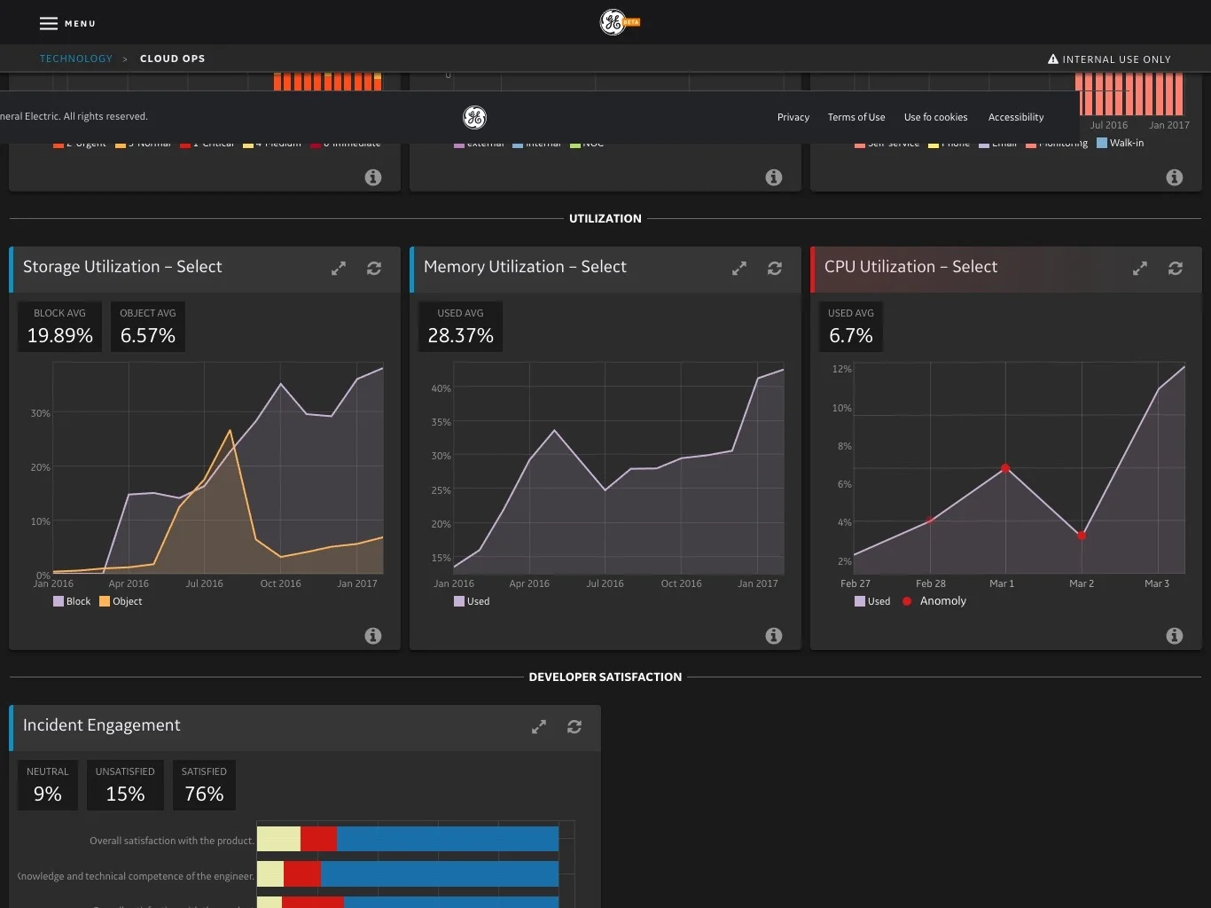
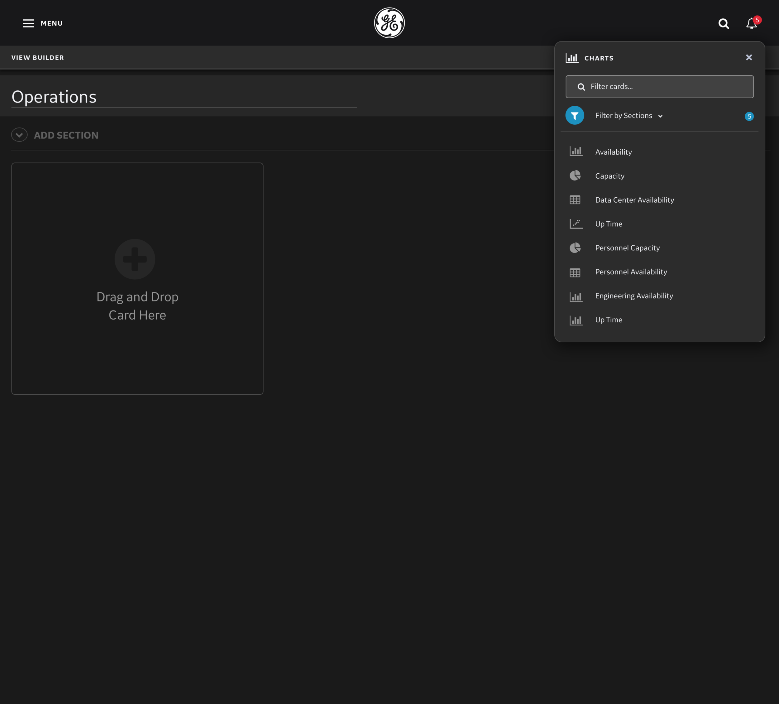
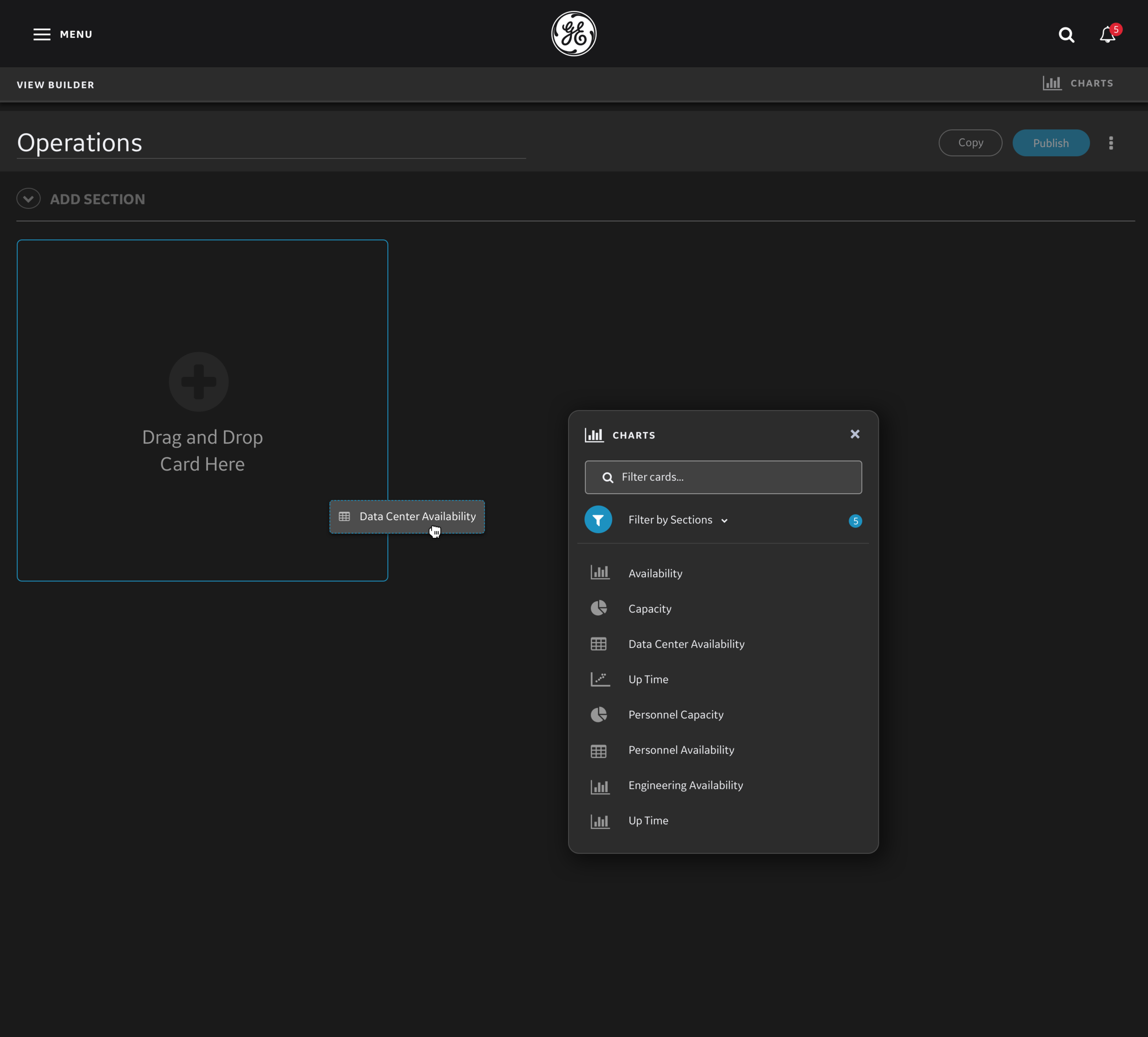
Design System & Chart Library
I performed extensive research into data visualization best practices to created a scalable UI & a versatile design system for data visualization. Additionally, all designs were created to meet accessibility standards for dark and light themes.

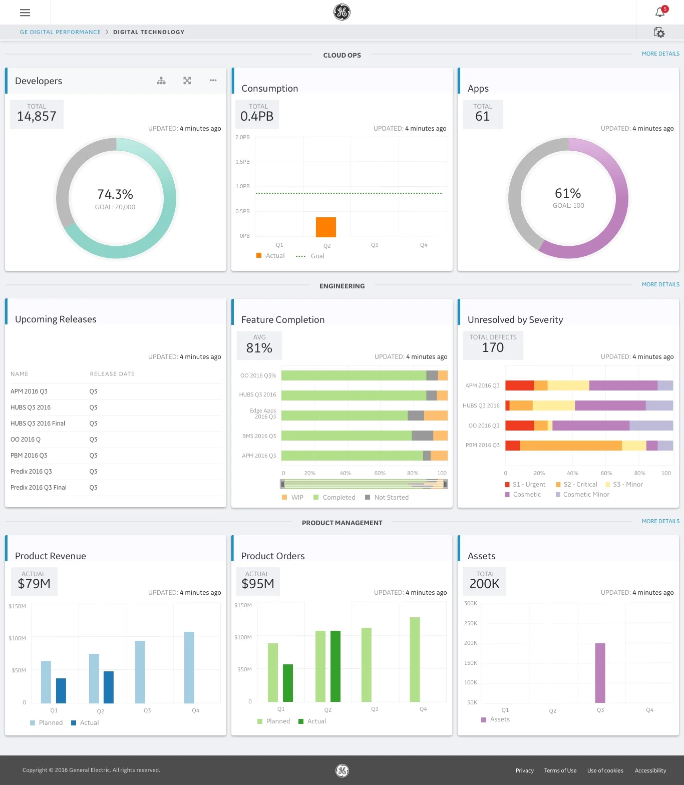
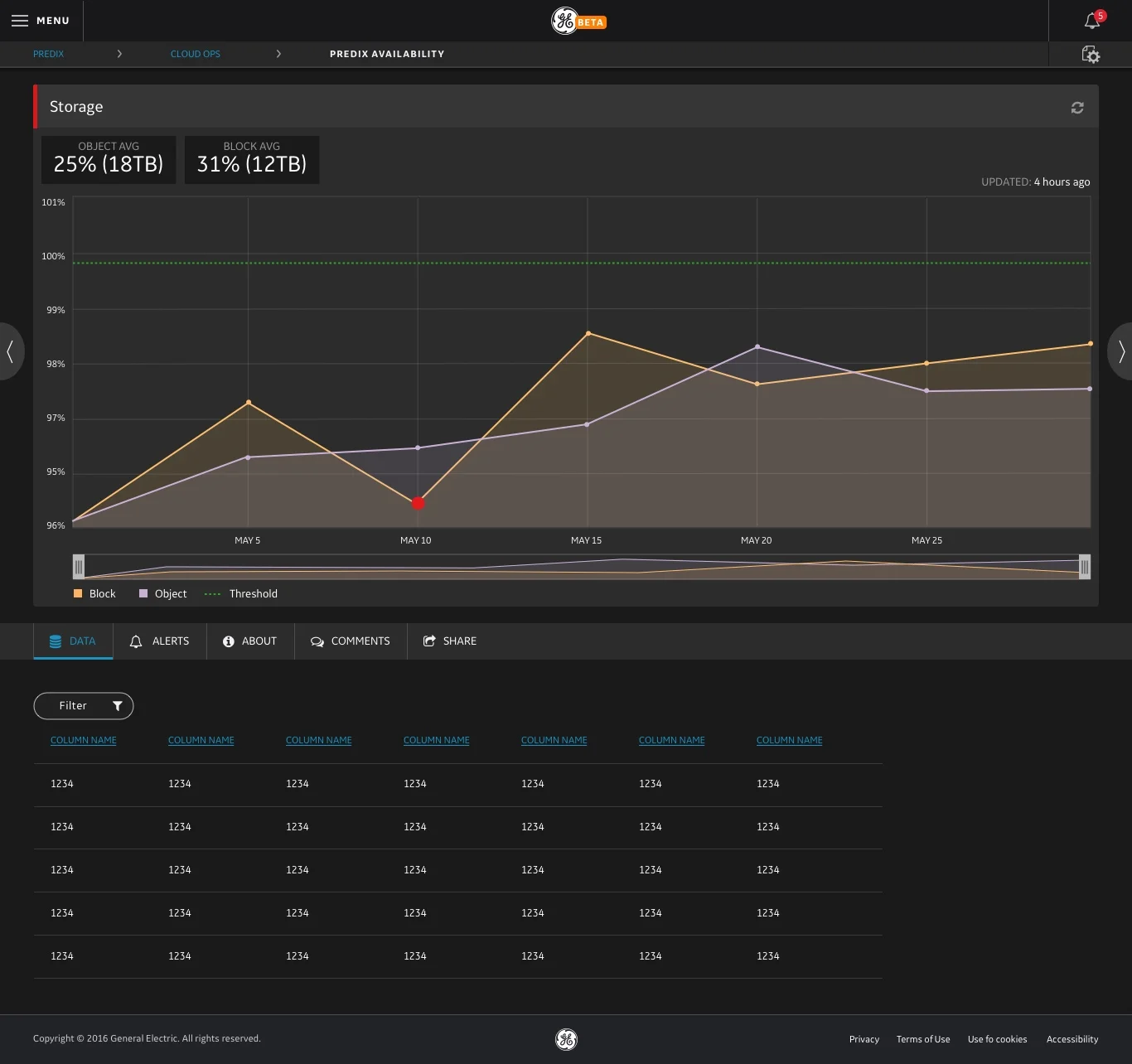
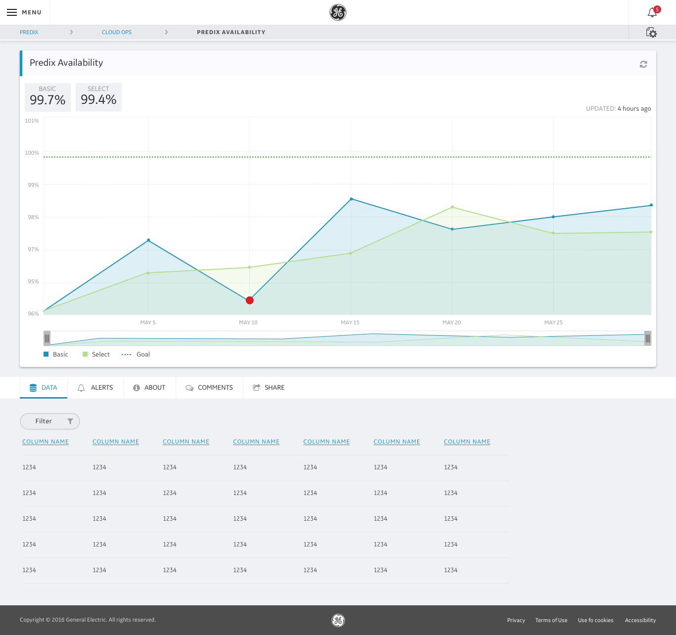
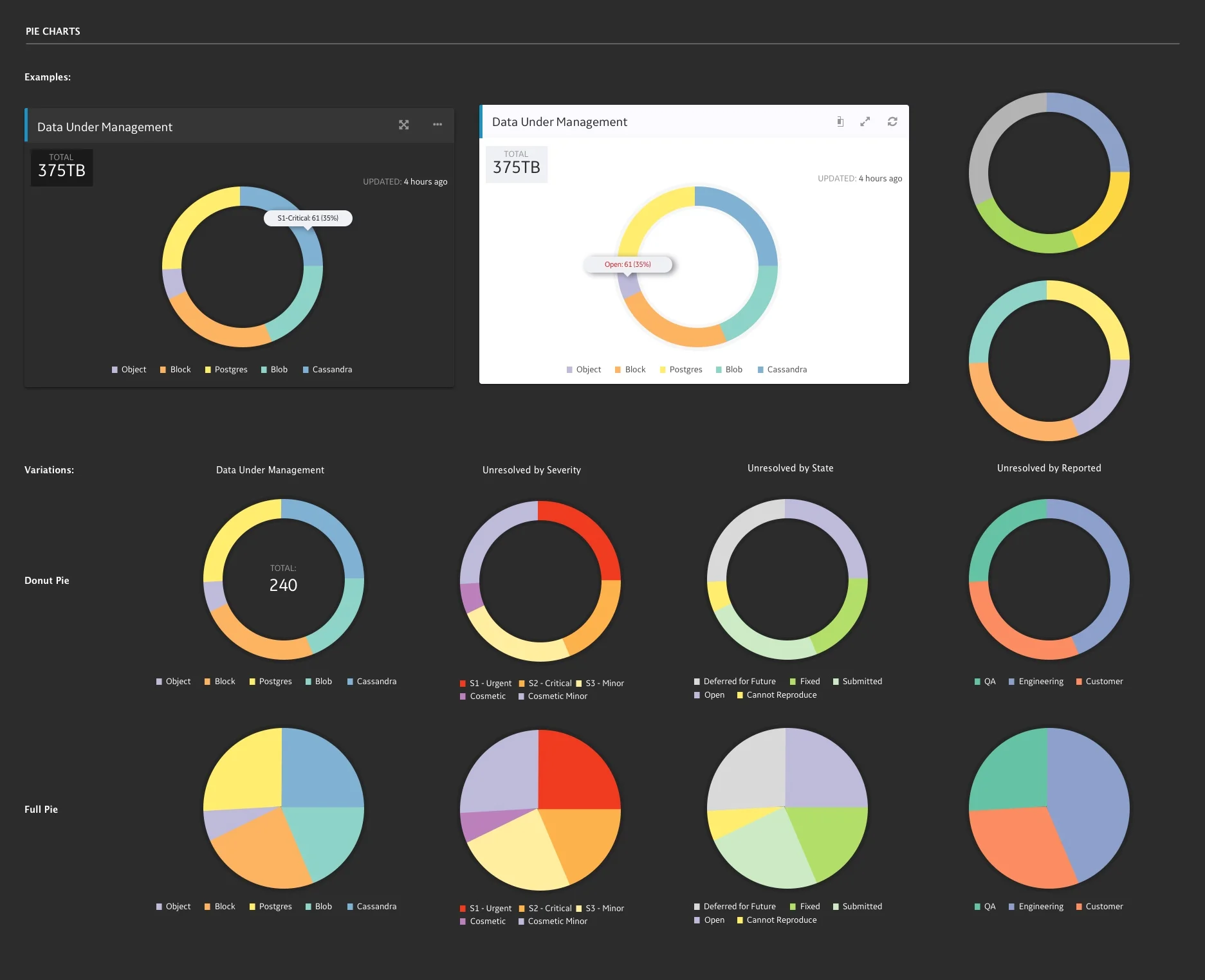
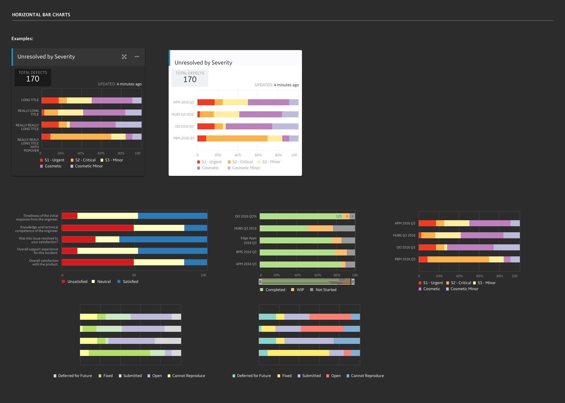
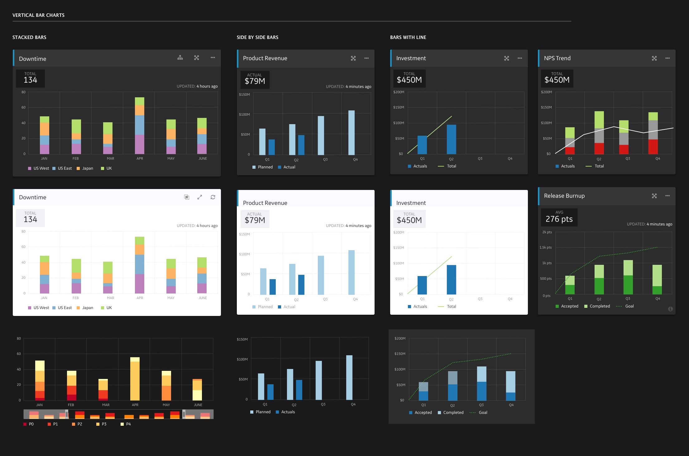
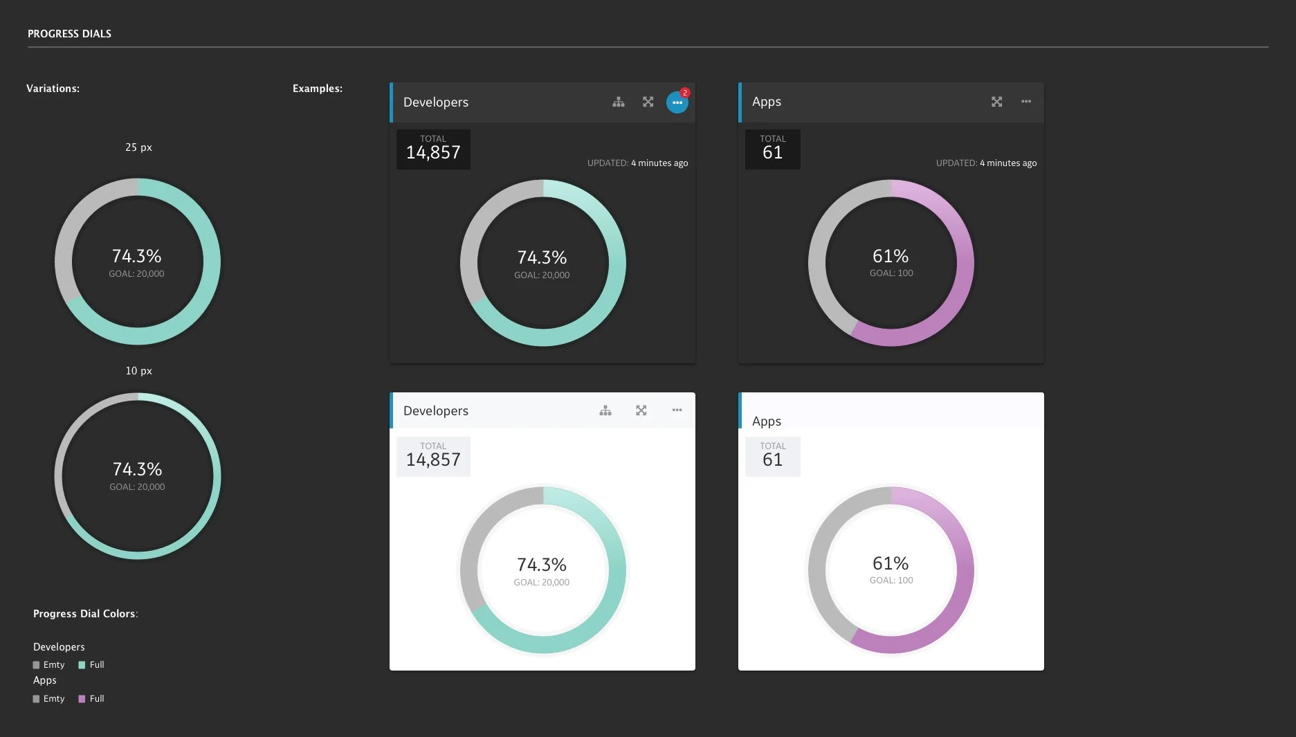
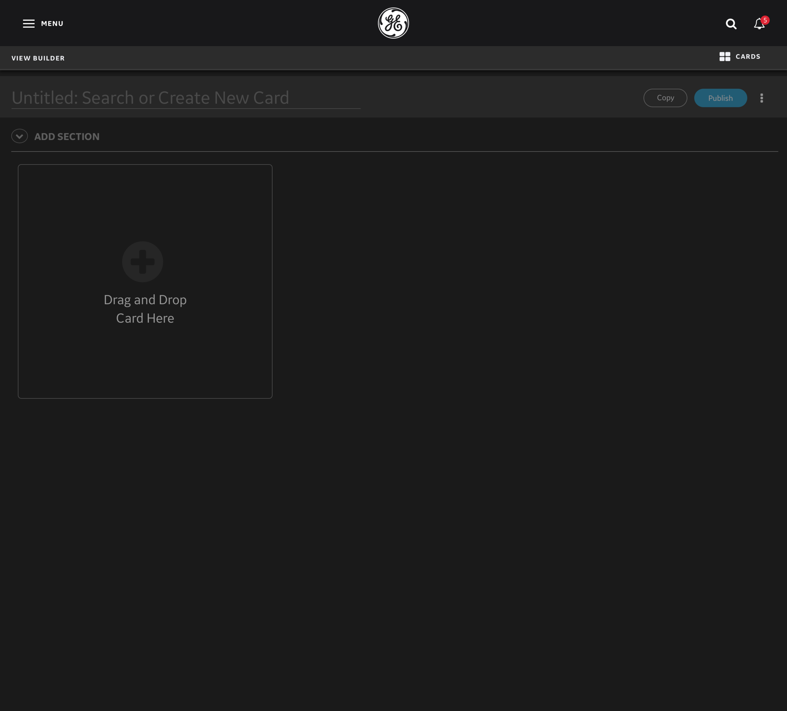
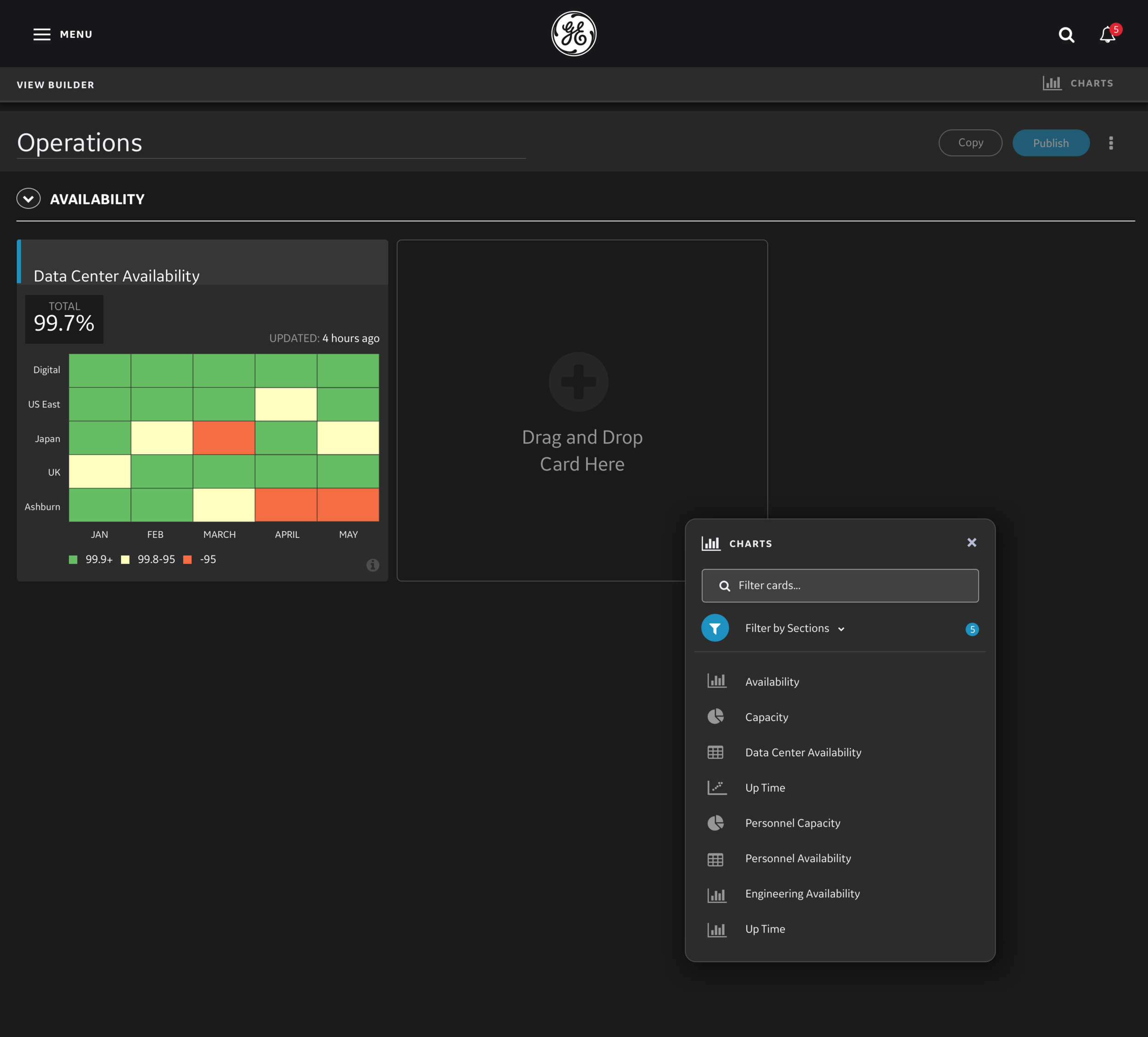
Chart & Dashboard Building tool
The tool allows users to create their own charts and dashboards to display the most relevant metrics that they need. I worked closely with another Interaction Designer to develop a chart building tool that met our user's needs.

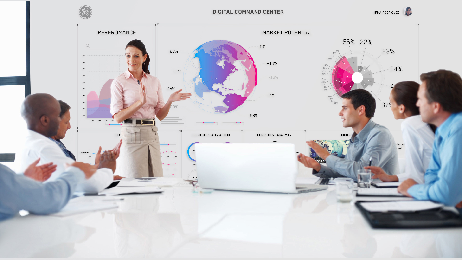
Large Format Displays
The application is designed to be fully responsive and supports large format displays like office TVs & touchscreens.