FireEye
Helix: Cloud Security Platform
Overview
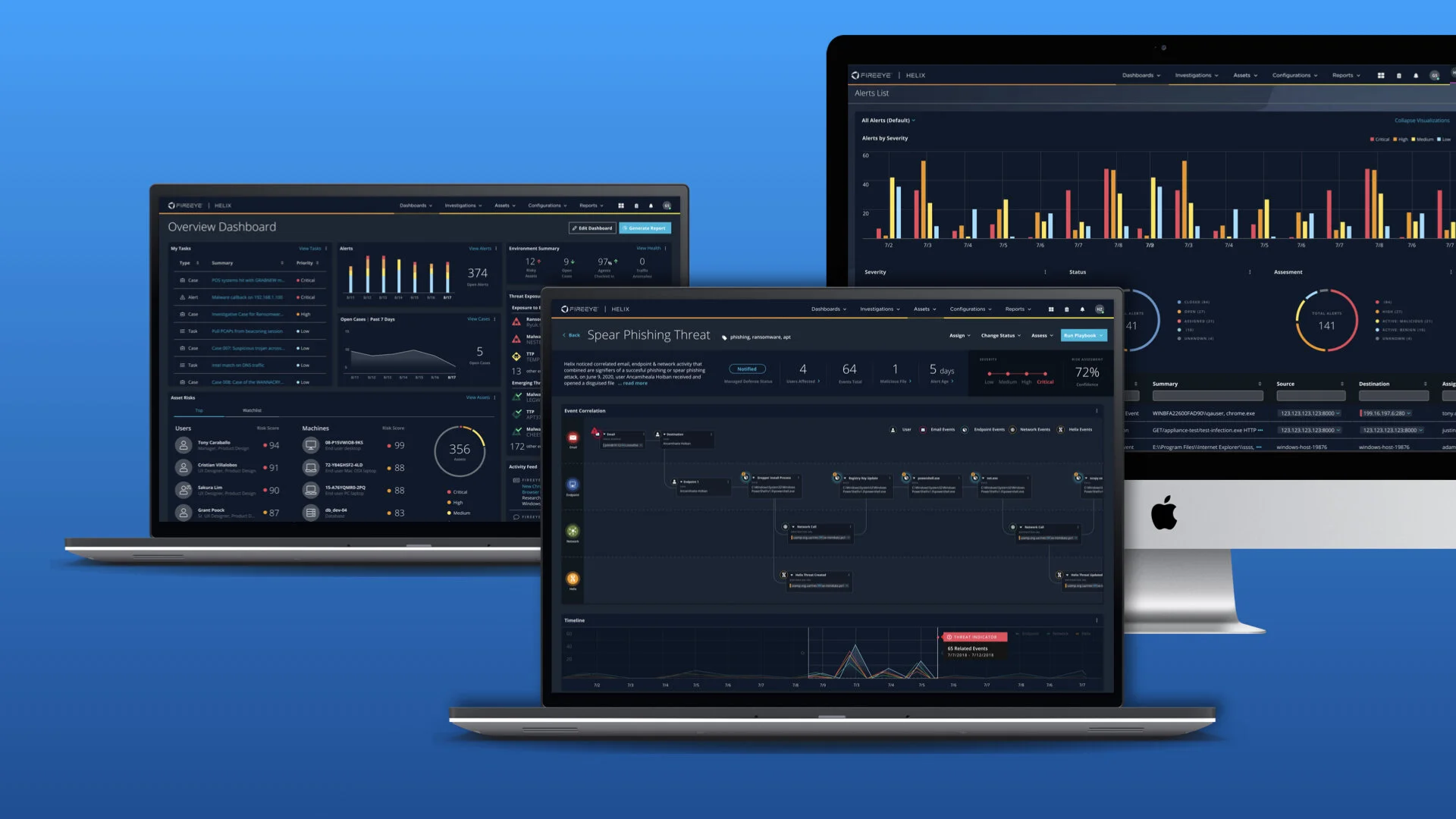
Helix is FireEye’s premier cloud-hosted security operations platform that allows organizations to take control of any incident from alert to fix.
Platform features
FireEye Helix is a cloud native security platform that integrates multiple stand-alone / on-prem products into a single seamless experience and augments them with advanced threat protection features, like:
Next-generation SIEM
Security Orchestration
Threat Intelligence
Alert Workflow Management
Investigation / Case Management
Unified / Customizable Dashboards
Advanced Reporting capabilities
My Role
Led UX design for FireEye’s flagship next-generation cloud security platform.
I conducted UX research to develop data and insights, test assumptions, and guide the development of new features to achieve business goals and meet
our user’s needs.
Worked closely with Product and Engineering teams to develop a powerful Alert Workflow module.
Helped to guide the strategy and design for integrating FireEye’s Services into the UI. Worked closely with Product and Engineering leads from both teams.
Created an alert visualization system to render complex detection data visually, reducing the time it took junior analysts to assess alerts.
Case Study: Alert Visualization
The Problem
Today’s approach to alert management is a confusing and time-consuming process. Alerts are largely managed in a vacuum as a single event in time. Users are presented with alert data that is highly technical, data dense, and hard to understand what happened. Newer analysts lack the skills required to interpret the alert and understand exactly what happened. Making conclusions often takes multiple steps, using different tools. Additionally, it’s left up to the analyst to determine what action to take.
Previous Design
The Solution
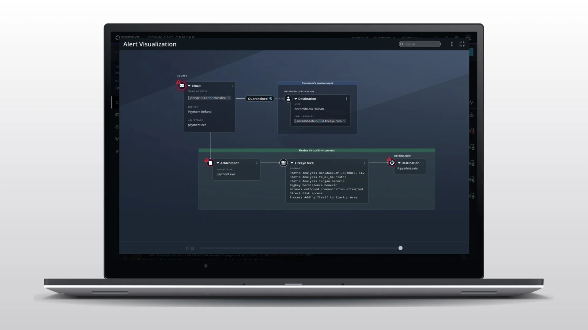
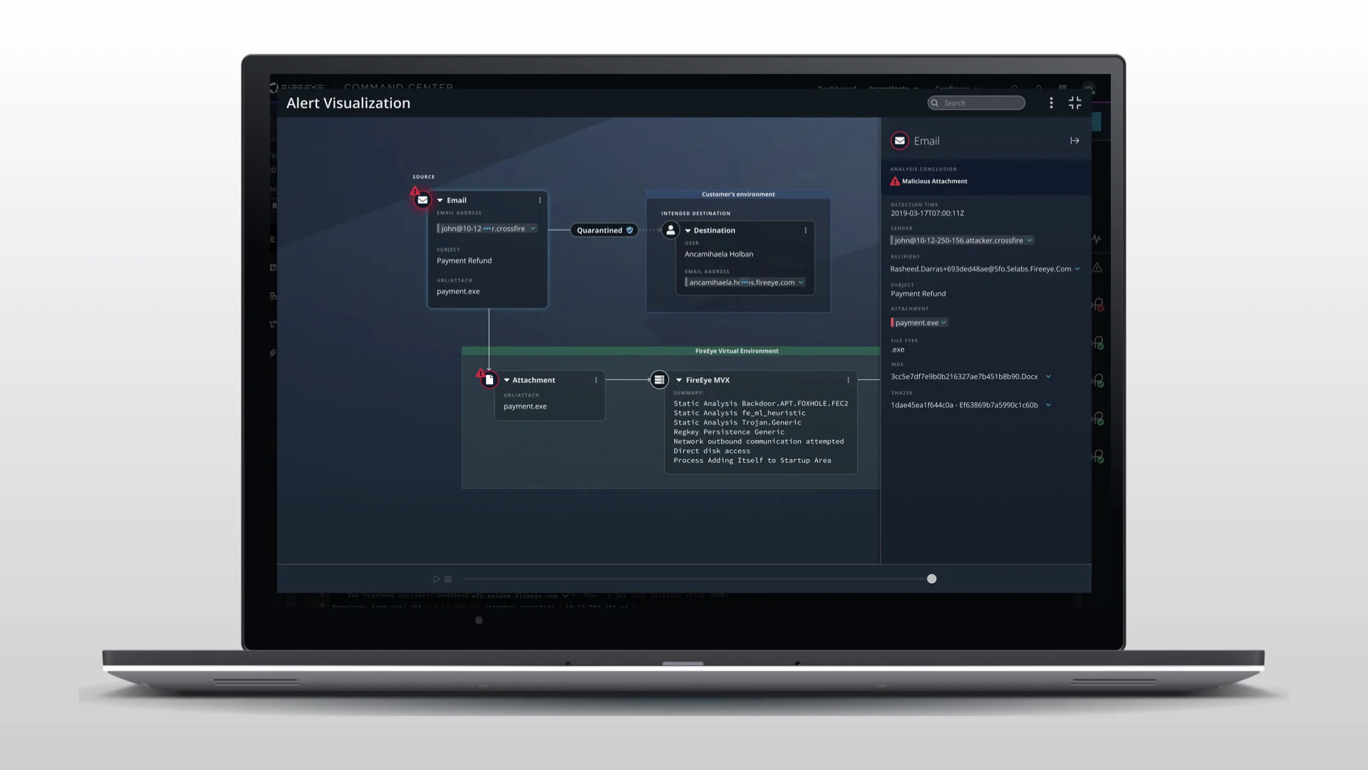
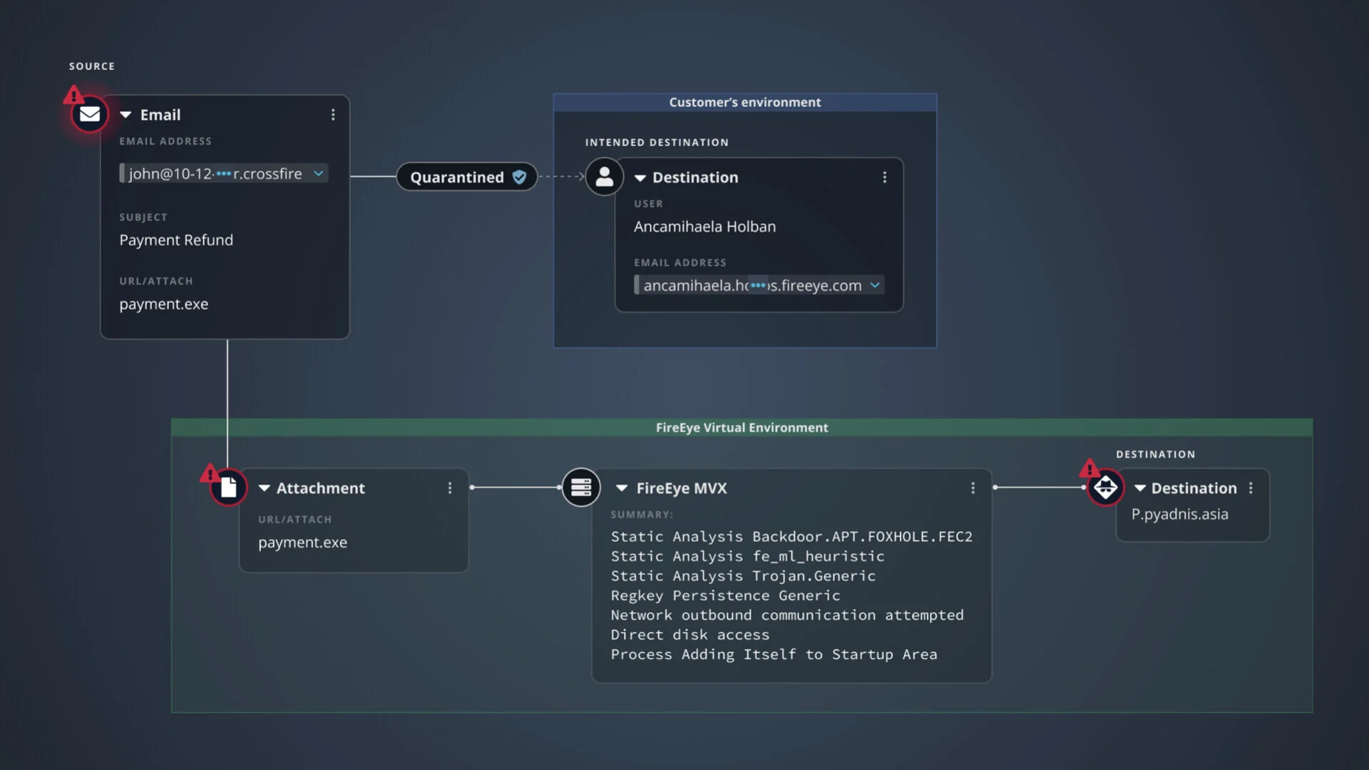
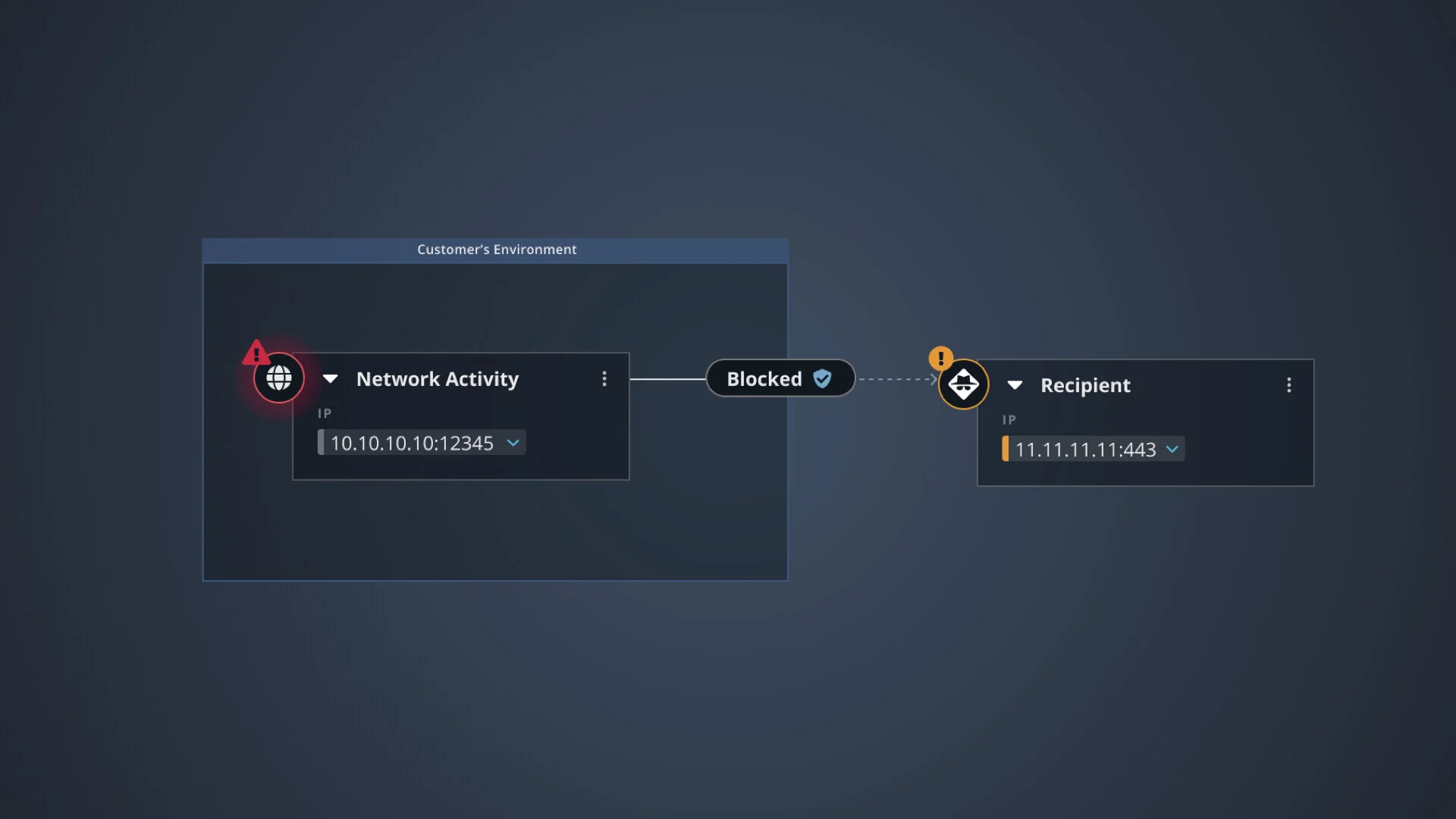
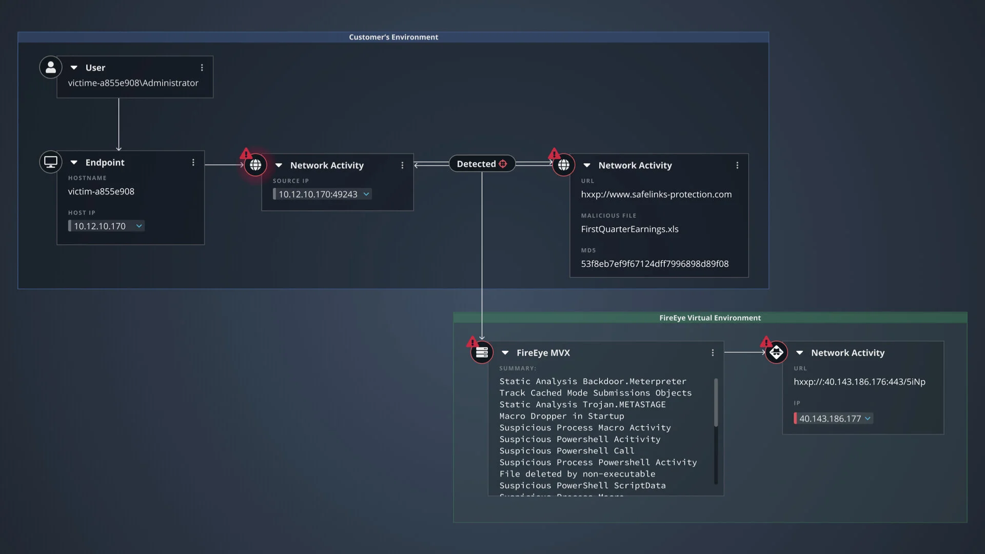
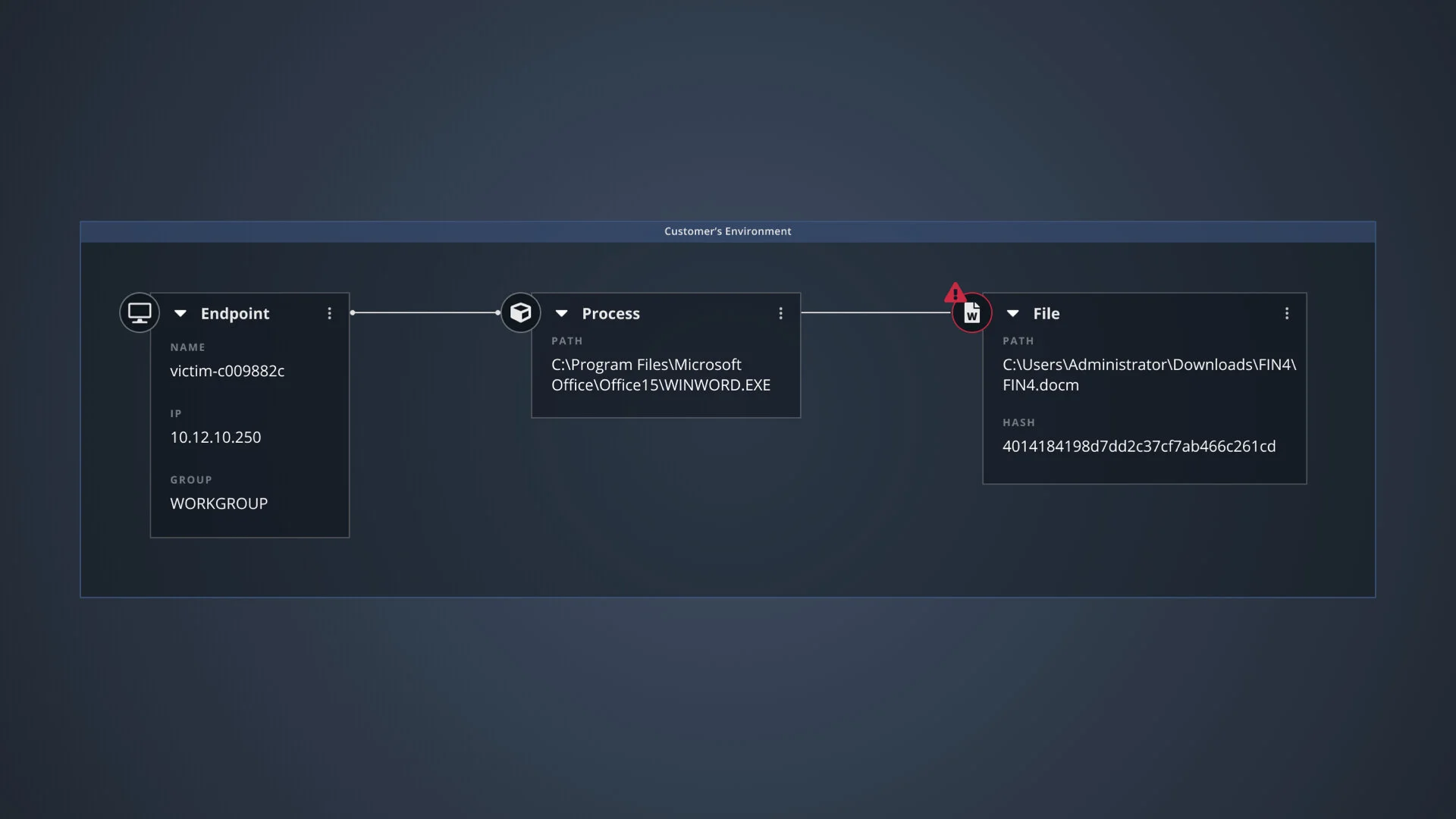
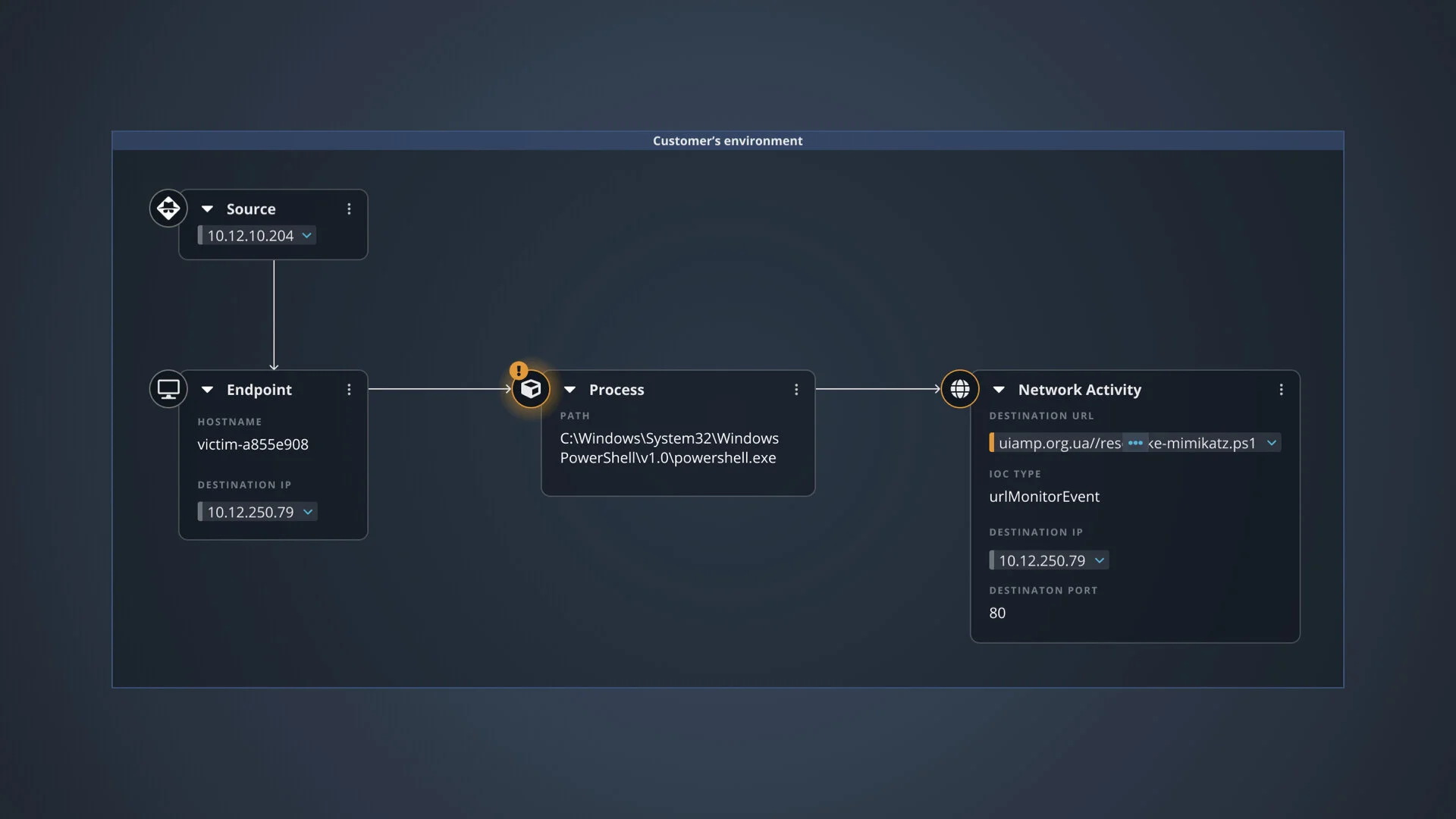
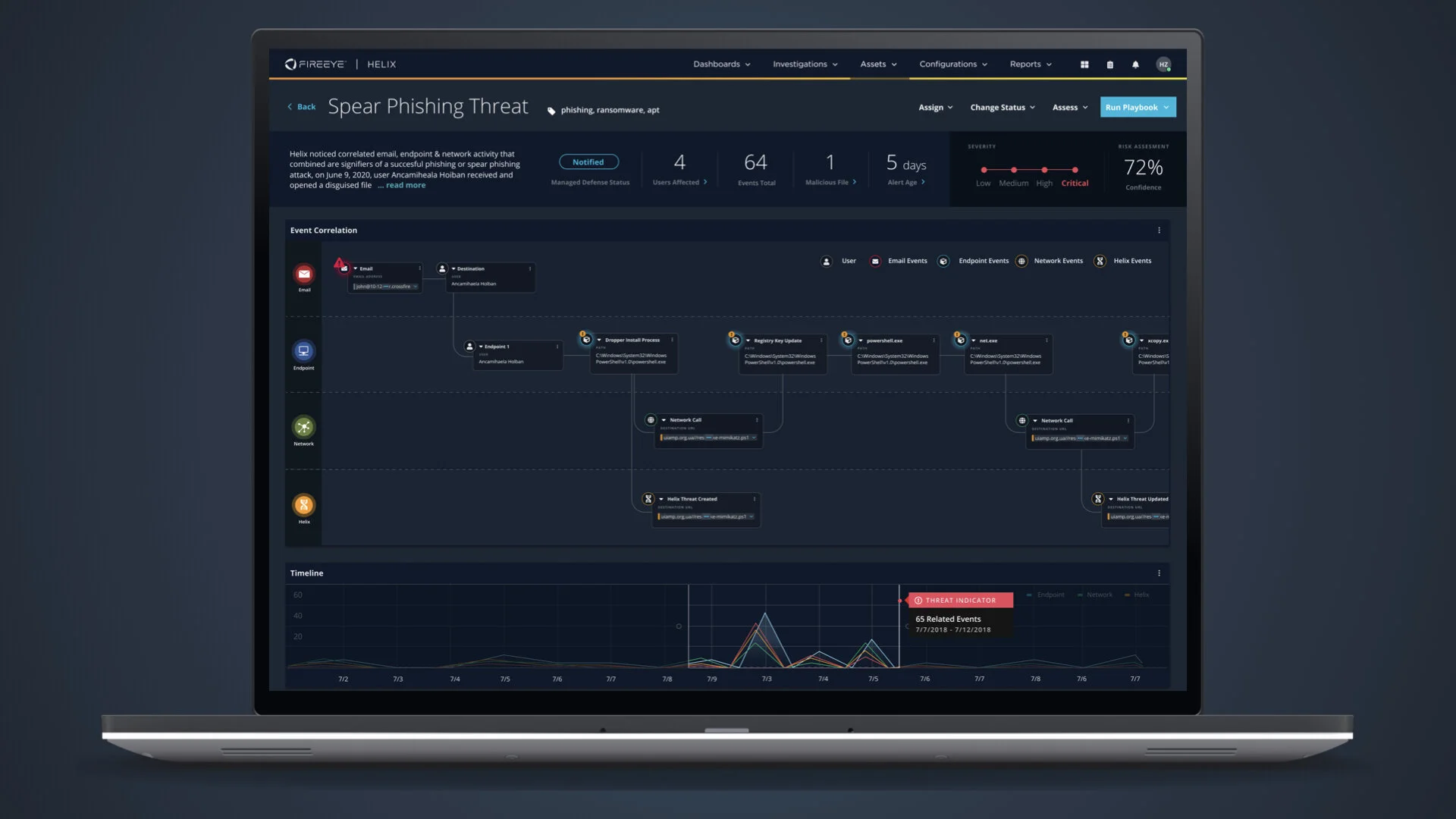
An interactive visualization library that is able to parse complex alert data and render it in a clear visualization showing users exactly what happened.
The visualizations told the story of:
What triggered the alert
Who was affected
Events that occurred or we’re attempted
Mitigations that were taken automatically
Source and Destination
Whether something is malicious or benign
Intel enrichment (Known Good, Bad, Unknown)
Any related / correlated alerts
New Design
The Process
In the discovery phase we decided to focus on making it easier for Junior Analysts to use our software.
I setup a working group that included Product and Data Science leads to meet regularly for collaboration sessions and review designs.
I facilitated a strategy workshop using the Lean UX Canvas to define business goals, metrics, and
hypotheses to guide UX efforts.
From there I lead the efforts from discovery to deployment, roughly in this order:
I crafted a research plan and interview questions
Conducted user interviews
Synthesized findings to understand our user’s needs
Created designs and prototypes for testing
Performed usability tests make sure designs solved the right problems
Iterated on designs (ongoing)
Performed A/B impression tests to further refine our designs
Iterated on designs (ongoing)
Validated our designs with users and key stakeholders along the way
Conducted user tests that showed the designs were successful
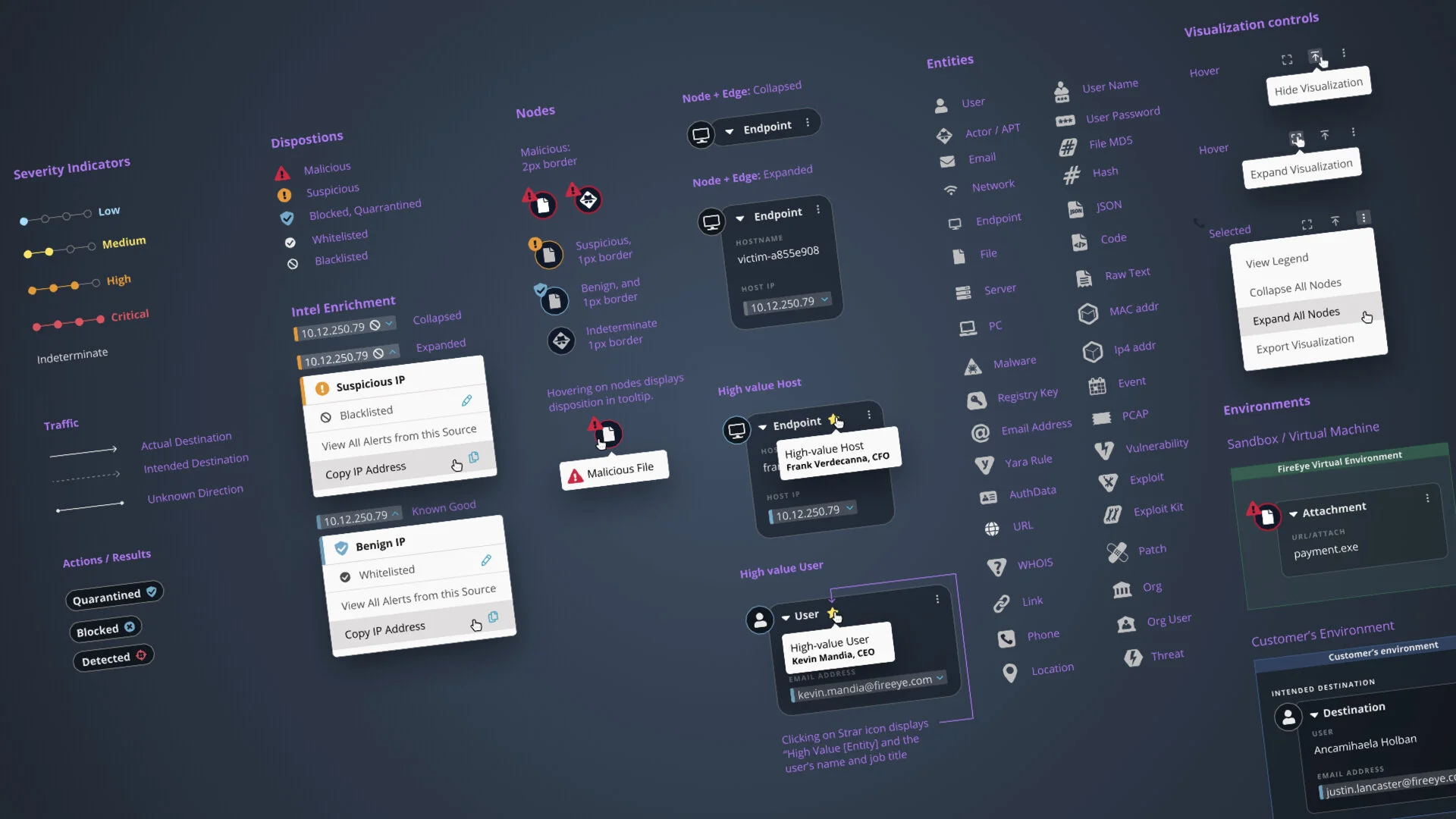
Broke designs down into a component library and a mini design system that could render all the different types of alerts
The Result
The experience increased analyst’s efficiency by creating a system that can parse complex alert data and render it in consistent, easy to understand visualizations.
The experience provided context and encouraged users to inspect elements to see the details and take appropriate actions to remediate the threat.
